BRIDGEATHLETIC
Training Performance Hub

The Gist
Background
BridgeAthletic replaces manual spreadsheets with a digital platform that streamlines training workflows.
Solution
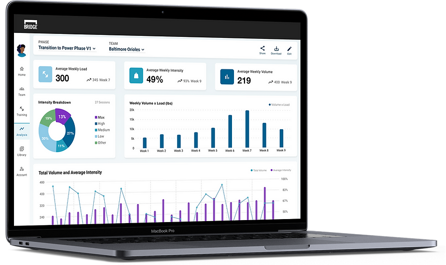
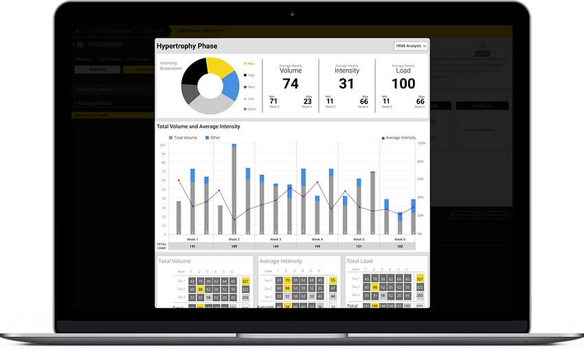
Our new dashboard connects training expectations to performance with Prelipin metrics, highlights outliers, and enables sharing.
Problem
BridgeAthletic lacked a program summary, forcing coaches to use external tools and hindering efficient evaluation.
Result
Eleven of fourteen coaches interviewed replaced Excel with the Training Performance Hub, confirming its success.
Behind the Design
Role
Lead Product Designer
Responsibilities
UI, UX
Research
VQA
Timeline
6 Months;
Conception to Launch
Team
1 CTO
4 Engineers
1 Designer
Before BridgeAthletic, strength coaches relied on lengthy Excel spreadsheets to develop and track high-performance training programs. Their athletes recorded results on printed cards, relying on manual entry to capture their results.
BridgeAthletic digitizes the process by eliminating manual data entry and maximizes data capture, allowing coaches to focus on developing human performance and achieving optimal results.
Background
Problem
Strength Coaches required a complete view of their training phases in a single snapshot to efficiently review and confirm their intended strength outcomes. Each training program must also be easily accessible by colleagues to streamline communication across departments.
However, BridgeAthletic lacked a complete program summary. Coaches relied on external tools and fragmented workflows, ultimately compromising the efficiency and accuracy of their evaluations.
Solution
Our new Training Performance Hub aggregates actionable data into an interactive dashboard that uses industry-standard Prilepin calculations to display high-level metrics across monthly, weekly, and daily intervals. It highlights outliers to reduce errors and provides shareable, staff-specific access to training programs.
78
%
The results were overwhelmingly positive.
Eleven of the fourteen coaches we interviewed post-release had fully adopted the Training Performance Hub as their primary tool for reviewing strength training phases, eliminating their reliance on Excel.
01
Foundational Research
Contextual Discovery
User Research Informed by Training Principles
To design an intuitive and effective user experience, I first immersed myself in the core principles that shape our users' decision-making. I began by studying Prilepin, the training concept our users rely on to build their programs. Understanding its framework, how sets and reps at varying intensities trigger physiological changes, was essential for conducting effective user interviews and brainstorming tailored solutions.
I led interviews and attended field studies to observe coaches' workflows, pain points, and workarounds, utilizing usability testing and observations to establish clear user goals. Through research, I discovered that strength coaches need both aggregated and detailed metrics.

Top Insights from Strength Coaches
Our research uncovered several key pain points that hindered coaches' ability to play, analyze, and collaborate effectively within BridgeAThletic, highlighting critical areas for improvement.
Snapshots
Strength coaches lacked a single view of training phases and had to rely on multiple tools to assess outcomes.
Sharing
BridgeAthletic couldn’t share programs across coaches, causing version issues and miscommunication.
Collaboration
A lack of real-time collaboration frustrated coaches and slowed down decision-making.
Stakeholder-Driven Data Visuals
To explore how best to present these metrics, I sketched a range of chart concepts, experimenting with different ways to balance clarity, detail, and usability for strength coaches. Charts were validated with our stakeholders to ensure usability.


Strength Coach Persona
These insights shaped my design decisions and informed a user persona that reflected the core needs of strength coaches, keeping solutions user-focused and grounded in real coaching workflows.

User Stories
After establishing the strength coach persona, I developed user stories to guide and support design development.
As a strength coach,
1
I want to track athletes' results against assigned weights so that I can quickly adjust their training.
2
I want to share 1 program to provide 1 source of truth so that I can reduce miscommunications.
3
I want to review the full phase so that I can ensure my athlete's strength will peak at the right time.
User Journey
Building on the persona, I outlined the user's journey to visualize their end-to-end experience and identify key moments of friction


Opportunities for Business
I constantly refined the design requirement to tackle the core business challenges: adding value, increasing engagement, and improving retention.
Speed and Results
Combining detailed and summary views eliminates multiple tools, streamlines communication, and enhances training effectiveness.
Data-Driven Decisions
Coaches can track session details and overall trends to make timely, data-driven adjustments.
Increased Engagement
The summary saves time and builds confidence by consolidating all training details and trends in one accessible location.
02
Approach
Streamlining Navigation
To improve efficiency, I designed an intuitive information architecture that aligned with strength coaches’ workflows. By structuring content around their key tasks—reviewing training phases, tracking progress, and collaborating, I created a seamless navigation system that reduced friction and improved decision-making.

Initial Wireframes
With a clear understanding of user needs, business goals, and the platform's structural foundation, I began translating insights into intuitive, user-centered solutions. I started with low-fidelity wireframes to establish the layout for data visualizations, metrics, and athlete information. I regularly reviewed my design decisions with key stakeholders, including our CTO and several strength coaches, reiterating our functional goals to maintain focus.
Recognizing that wireframes can be challenging to interpret, I made them clear and easy to understand, effectively communicating the design's flow and structure. Once the basic layout was validated, I refined the design by adding more detailed elements.


Enhancing the User Experience
This refinement in the design led to a clearer, more structured experience for coaches. To illustrate how users interact with the updated interface, I mapped out a user flow that outlines key actions and decision points within the platform.

03
Final Design
Final Design Walkthrough
With the goals and structure clearly defined, the final user flow brings the experience across three key sections to life. Due to the level of effort, we decided to save the sharing features and direct workout editing for a subsequent release.


04
Measured Impact
Outcome
Through ongoing check-ins, we saw clear improvements in engagement and workflow. Seventy-eight percent of coaches adopted the Training Performance Hub, reducing their reliance on Excel. This shift streamlined their workflow and improved athletes’ training experiences through faster adjustments and more accurate performance tracking. Coaches were able to focus more on coaching and optimizing athlete performance.
05
Re-Design
Design Refinement and Reflection
As I reviewed both the developers' implementation and my original designs, I identified areas where the experience could be further improved. Through this critique, I refined the UI structure and developed an updated design solution, though it was not ultimately implemented.

Redesigning for Clarity and Functionality
Building on the insights from my critique, I created a new design that significantly improved the platform’s overall usability. I focused on enhancing readability and digestibility through clearer visual hierarchy and better content organization. Functionality was also expanded, introducing features like easier sharing to support real-world workflows. In addition, I modernized the UI, elevating the look and feel to create a more polished, intuitive, and professional experience.